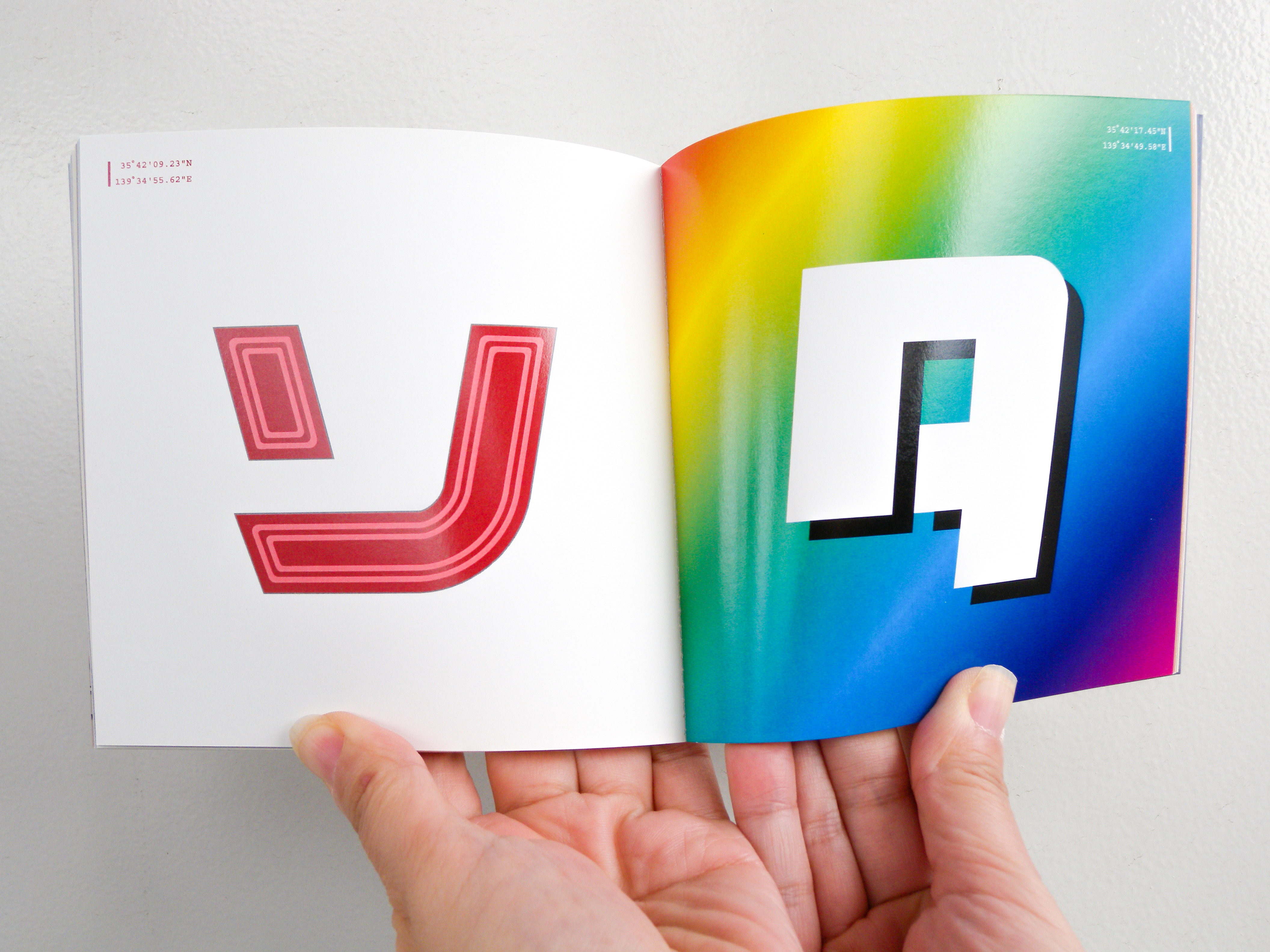
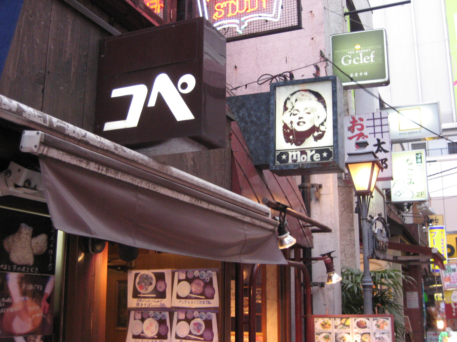
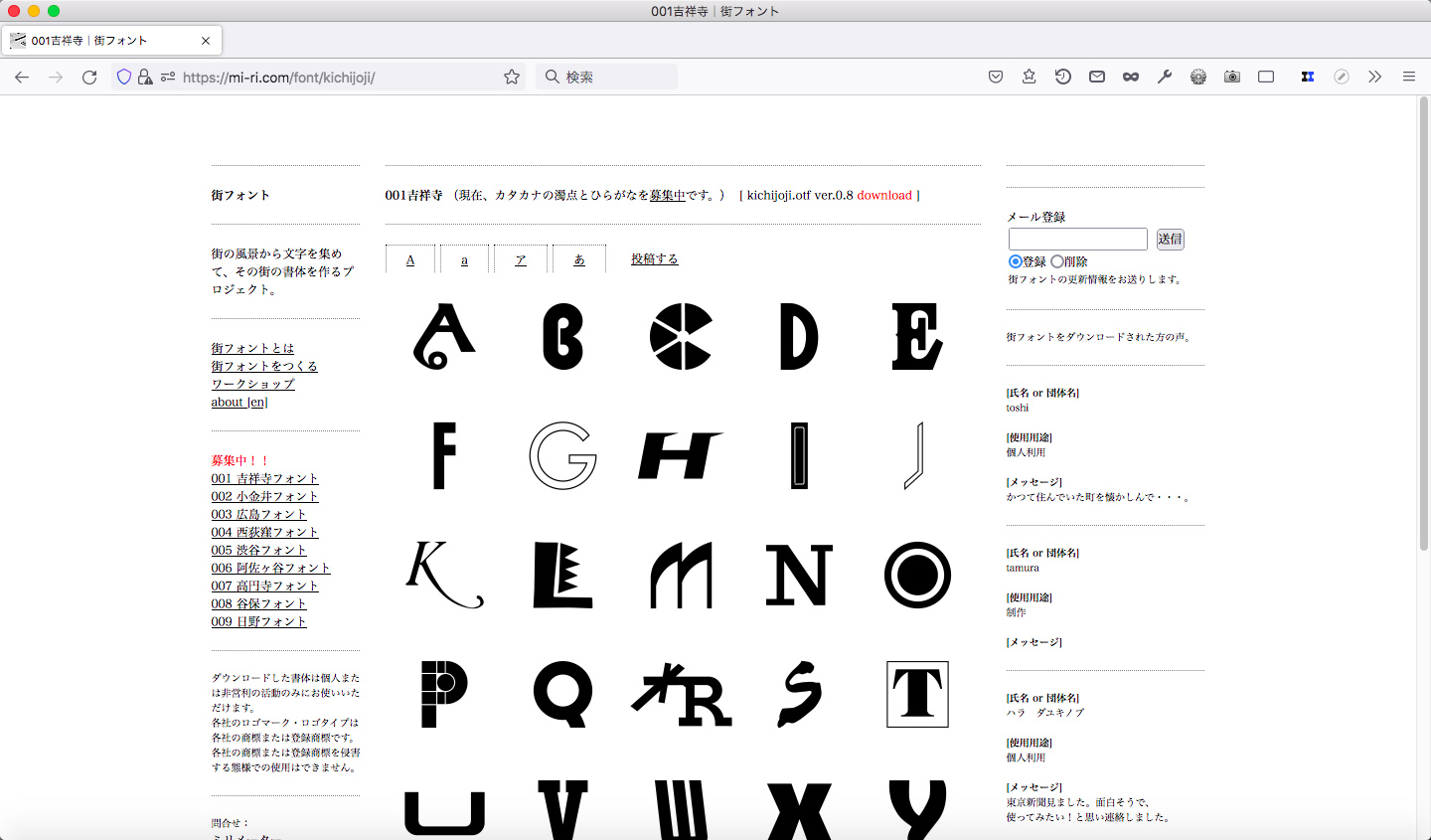
東京の風景は看板によってできているといっても良いほど、看板が多い。普段なにげなく歩いている街の文字は、無意識にその街の風景となっている。その風景としての文字を切り取り、採取する。
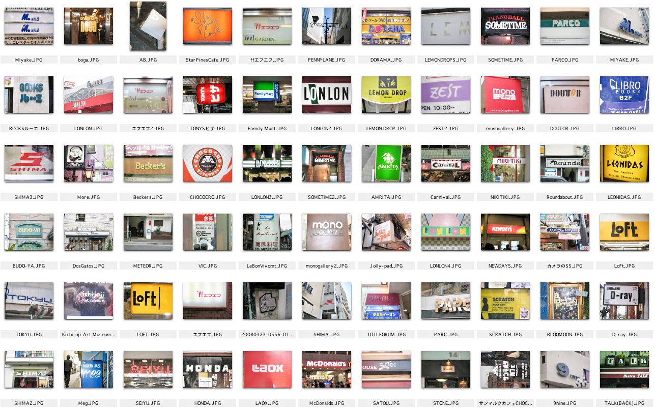
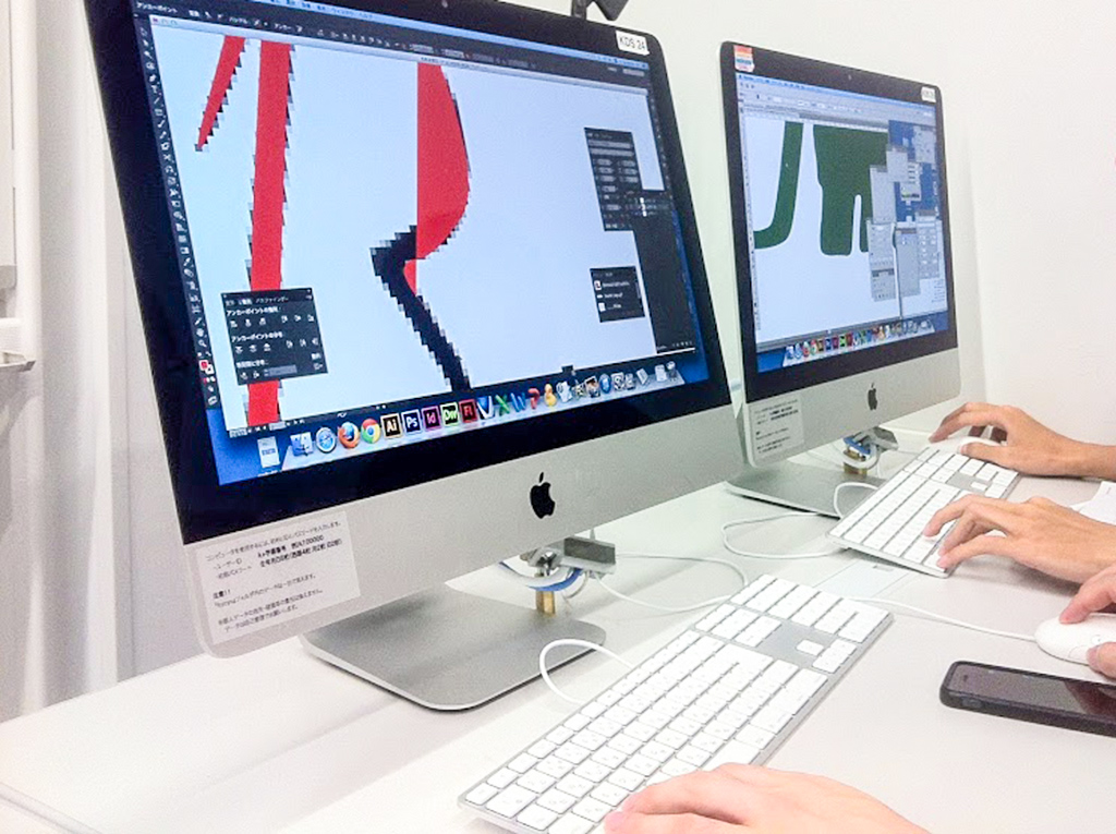
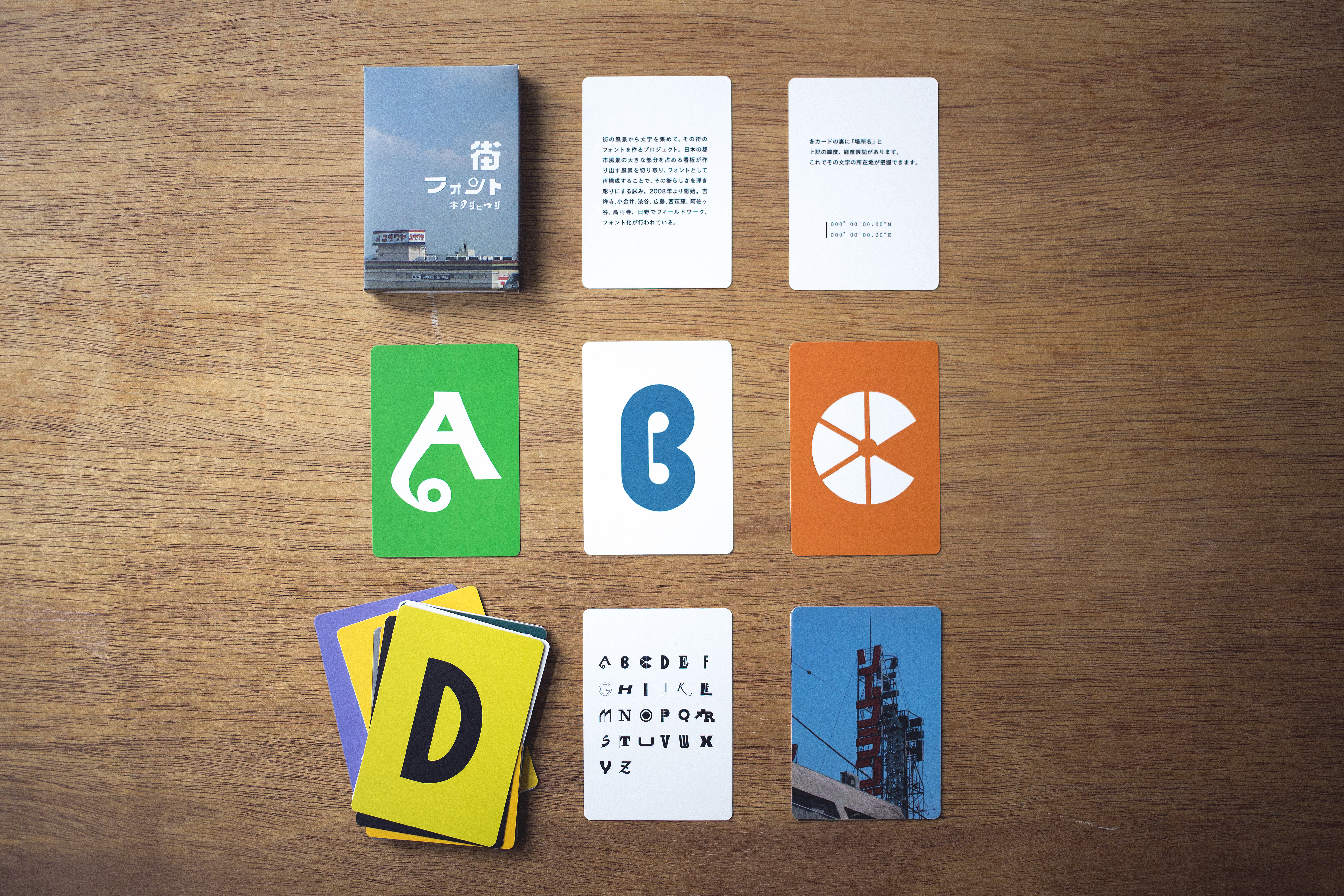
街ごとに集めたアルファベットと50音の文字からブックとPCのフォントをつくる。
文字は、店名などの意味から切り離され、ひとつのカタチとなる。このブックを眺めていると、なじみのある街なのに見たことはあるが思い出せない文字がたまにある。記憶の中の街を歩いて、文字のある場所を思い出そうとすると、その文字にまとわりついている匂いや音のような環境が思い浮かんでくる。
街は断片となり、意味が漂白されることで、街そのものの体験をシミュレートすることができるのだ。
*各フォントの上端にはその文字の位置情報/緯度経度が記されている。
Tokyo’s landscape is made up of signs, we can say. The letters and characters we see while we walk in the city,
is deeply embedded in our minds. We cut off the letters, and collect it.
We turn the each city’s collected alphabet and Katakana into font for book and PC.
The letters will be detached from the meanings of original store names etc, and becomes a form by itself.
When we read the book, even if the letter is taken from the city we went,
sometimes there are letters from which we can’t remember the store name.
When we walk the city inside our memory, and when we try to remember where the letter was,
we remember the environment such as smell and sound that are attached to the letter.
The city turns into pieces, and meanings are bleached, thus we can simulate the experience of the city itself.
http://mi-ri.com/font/
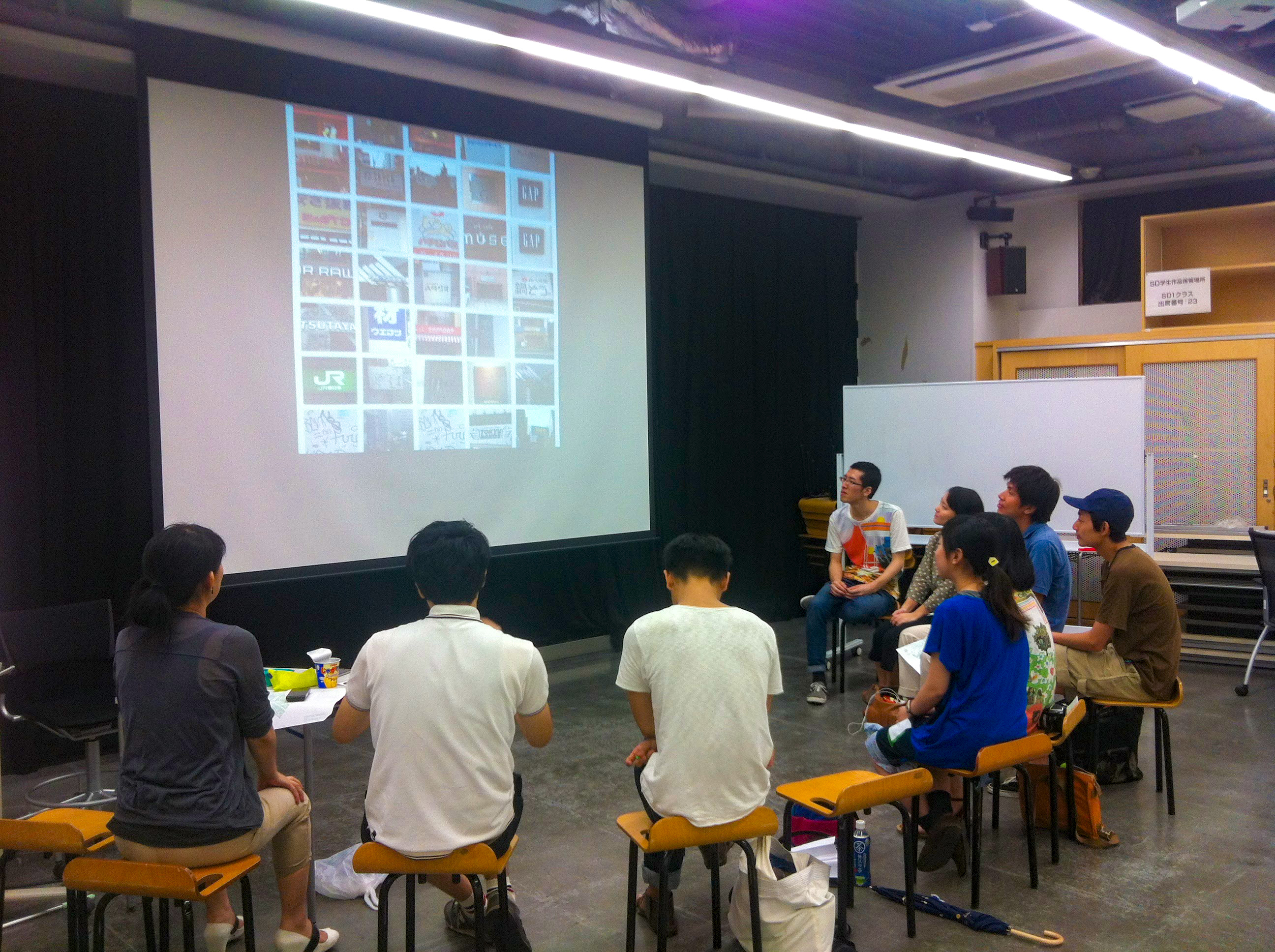
これまでの実施地域(共催団体)
001 吉祥寺フォント(自主事業)
002 小金井フォント(中央線ラインモール)
003 広島フォント(個人有志)
004 西荻窪フォント(NPO法人KISS)
005 渋谷フォント(桑沢デザイン研究所学生有志)
006 阿佐ヶ谷フォント(「ふかすぎ」誌面企画)
007 高円寺フォント(「ふかすぎ」誌面企画)
008 谷保フォント(npo法人くにたち富士見台人間環境キーステーション)
009 日野フォント(ひの市民大学)
010 大森フォント(アトレ大森)